Visual Assets Page
Define the visual aspects of the Windows Store App: its default tile, logo images, text and background colors, splash screen and lock screen tile appearance.
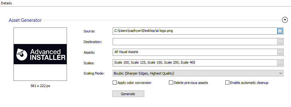
Asset Generator
Create all the assets required for your Universal Windows Platform app by loading a single source file.

Source
The source image used to create all the other visual assets.
There are some Windows limitations in the .SVG image support. You can find out more
information in this article : Why my SVG image isn't
rendered properly?
Destination
The path on disk where the assets are created.
Assets
Press the to select what asset types are generated (Tile, Icon, Splash Screen, Badge Logo).
Scales
Press the to select what are the scales of the generated assets.
Scaling Mode
The scaling used when creating the generated visual assets.
- Bicubic (Sharper Edges, Highest Quality)
- Bilinear (Sharper Edges)
- Nearest Neighbor (Smoother Edges)
Apply color conversion for Windows Light Theme.
Using this option, when generating Windows Light Theme specific assets (with the alternate form resource qualifier: "altform-lightunplated"), the white pixels will be converted to black pixels.
Delete previous assets
This option deletes all previous assets before generating new ones. For example, if you generate images for a specific group of assets and use this option, the other images will be removed before generating.
Enable automatic cleanup for unused assets.
Using this option, the assets that become unused after generating new assets with the same attribute names and scales, but with a different app id, are deleted. This only applies if these assets are not used by another application.
Generate
Press the button to create the assets and automatically populate the Visual Assets page.
Tile
The default tile that is used for the Start menu.
Short Name
A short name for the app that is displayed directly on the tile.
Show Name On
The tile sizes, as expressed by their logo size, that should display the app's display name. The logo size can have one of the following values:
- Medium
- Wide
- Large
Background Color
Select the background type and color of the tile.
Tile Logo
Specify images to be displayed when the tile is rendered in various formats.
Small Logo
The small square version of the logo image. Format range includes:
| 126 x 126 px | 284 x 284 px | 142 x 142 px | 107 x 107 px | 89 x 89 px | 71 x 71 px |
|---|
Medium Logo
A medium-size image used as the app's square tile. Format range includes:
| 600 x 600 px | 300 x 300 px | 225 x 225 px | 188 x 188 px |
|---|
Wide Logo
These images are displayed when the tile is rendered in its wide format. The range includes:
| 1240 x 600 px | 620 x 300 px | 465 x 225 px | 388 x 188 px | 310 x 150 px |
|---|
Large Logo
The large square version of the logo image. Format range includes:
| 1240 x 1240 px | 620 x 620 px | 465 x 465 px | 388 x 388 px | 310 x 310 px |
|---|
Tiny Logo
A small image shown in the corner of the tile to identify the app. Format range includes:
| 176 x 176 px | 88 x 88 px | 66 x 66 px | 55 x 55 px |
|---|---|---|---|
| 256 x 256 px | 48 x 48 px | 24 x 24 px | 16 x 16 px |
Splash Screen
Define the appearance of the splash screen, which is displayed by the app during launch.
Background Color
Specify the background color of the splash screen.
Splash Screen
The path to the splash screen image. Format range includes:
| 2480 x 1200 px | 1240 x 600 px | 930 x 450 px | 775 x 375 px | 620 x 300 px |
|---|
Badge Logo
Defines the badge that represents the app on the lock screen, which is shown when the system is locked.
Logo
A monochromatic logo image that is shown next to the badge to identify the app. Format range includes:
| 96 x 96 px | 48 x 48 px | 36 x 36 px | 30 x 30 px | 24 x 24 px |
|---|